National Geographic Lindblad Expeditions
Optimizing Expedition Discovery:
Enabling Confident Booking Decisions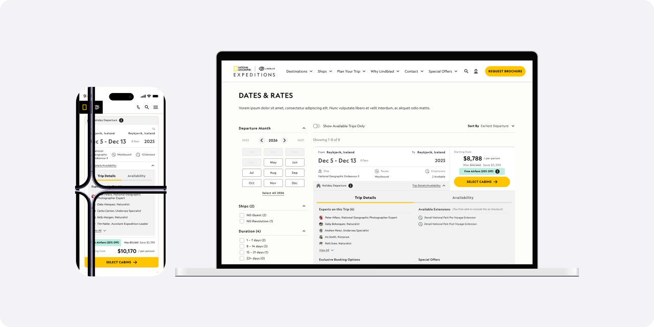
The Challenge
Finding the right expedition was one of the biggest friction points in the booking journey. The project started as a way to help users find their ideal trip and departure more easily. After a careful audit of the flow, I identified three main areas for improvement: the search feature in the top nav, the overall use of filters, and the departure cards. This case study focuses on the third.
Our existing departure cards acted primarily as links into checkout, showing only basic trip information like dates, price, ship, and itinerary.
Users frequently had to leave the expedition page—or contact an Expedition Specialist—to answer critical questions before deciding whether to book.
The business wanted to improve expedition discovery and increase users' confidence before entering the booking flow.
My Role
- Product Designer
Project Length
- 3 Months
Skills
- Product Design
- Product Strategy
- Design System
- Prototyping
- Documentation
Business Goal
Enhance departure search and trip discovery across the website while helping guests make informed booking decisions earlier in their journey.
Understanding the Journey
At each stage of the journey, users are asking different questions and looking for different kind of information:
- Homepage → Inspiration & Guidance: The user is exploring possibilities, looking for inspiration, and seeking guidance on where to go and what might be right for them.
- Destination Page → Narrowing Options: The user has chosen a destination, but still needs help understanding the different options and narrowing down what best fits their needs.
- Expedition Page → Building Confidence: The user is considering a specific expedition. Our role is to provide the information and reassurance they need to feel confident that this is the right expedition for them.
- Booking Flow → Completing the Purchase: The user has made their decision. Our focus is to make the booking process clear, easy, and frictionless so they can confidently complete their purchase.
UX Research
Given the project’s tight timeline, we conducted rapid remote user interviews and analyzed behavioral data from user sessions in Fullstory and Amplitude, including click-through rates and engagement metrics. This helped us understand how users interacted with the departure page and how the different information cards were performing.
Our goal was to optimize the departure search experience, helping users feel more confident and informed when comparing options and deciding whether to book a trip.
Across interviews, we consistently heard the same questions:
Combining these insights with our behavioral data, we identified four key unmet needs:
- Cabin availability
- Included amenities
- Expedition team
- Extensions
Solution
We designed around three principles:
- Progressive disclosure: We layered the information to keep the experience scannable while still giving users access to more detail when they needed it.
- Decision support: Surface the information users need before asking them to commit.
- Stay in context: Allow guests to continue exploring without leaving the expedition page.
Close State (desktop + mobile)
In the default state which we could consider the first layer of the card we surfaced the information users need at a glance, including duration, route, and available extensions. We also reworked the information hierarchy and reorganized the content to make the card easier to scan and understand.
Impact
Expected outcomes:
- Reduced uncertainty
- More informed booking decisions
- Less dependency on customer support
- Consistency across expedition pages
- Increase in reservations
Results after launch:
- 52.9% of guests who interacted with the new cards proceeded to the checkout flow (up from 12.7% with the previous card design)
That means users who interacted with the new cards were 4× more likely to enter the checkout flow.
More importantly, these same users were 5× more likely to make a reservation, suggesting the experience helped move guests from exploring an expedition to taking action.
What I Learned
- Improving a booking experience isn't always about reducing steps or redesigning the entire interface. In this case, we focused on giving users the right information at the right moment—providing enough context to build confidence without overwhelming the initial experience. Progressive disclosure allowed us to preserve a lightweight, scannable interface while creating space for deeper exploration and decision-making.
- One of my biggest learnings was the value of watching real user sessions alongside quantitative data. Reviewing different user behaviors helped me understand where users were struggling, where they were successfully completing tasks, and—just as importantly—which areas didn't need to change.